Datasets submission
The usage of our tools is extremely simple. When a new submission is desired, user is presented with following simple form (mouse-over and click over the element for more information):
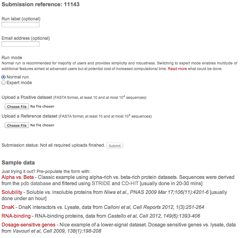
The form has following components:
-
Basic information
Run title and email address. Both are optional, however, the email address needs to be either empty or filled in and valid. Arbitrary text in the email field will prevent submission.
-
Run mode
This allows switching to expert mode and altering run paramenters. Please see documentation for details.
-
Input data
Two sequencees in fasta format are expected. The first sequence can be thought of as the signal (positive) and the second is a reference
-
Submission status
This field is periodically updated and informs user about the status of the submission. The submit button is inactive until all of the required information is provided.
-
Sample data
Here an updated list of examples is provided. This can be used to try out the tool without the need to have any datasets ready. A single click to a dataset of the user's choice pre-fills all the field required for successful submission.
Output interpretation
The usage of our tools is extremely simple. When a new submission is desired, user is presented with following simple form:
Individual scales
The first chart focuses on individual property strengths. On the left-hand side, we can see
a plot sorted by individual item's Z-scores and on the right hand side are corresponding
scale titles. The plot is also interactive and if a bar is clicked, it gets highlighted
in the table, making data exploration a breeze.
The plot shows contrast between the two datasets. If a bar points to the left,
(towards the positive set), it means that the property is stronger on the positive set
and vice versa. For example, if a hydrophobicity scale points to the right, it means
that the negative set is more hydrophobic or, conversely, that the positive set is less
hydrophobic (or more polar if you like).
The individual properties are also colour-coded and the colour corresponds to
grouping in the second section.
Each of the lines of the table shows scale description including its source and there also is a coverage and associated Z-score shown. It is possible to sort the table by clicking on the headers, however, the sorting is not reflected in the plot (but you can still click the bar and see the item in the table).
In most cases, users can see large scale of properties with their corresponding strenghts. However, in case if there is not enough signal contained in the datasets, there may be only a small number of scales shown. Lastly, if there are no properties strong enough to pass the threshold, the analysis stops and the tool showns appropriate message.
Important concepts
-
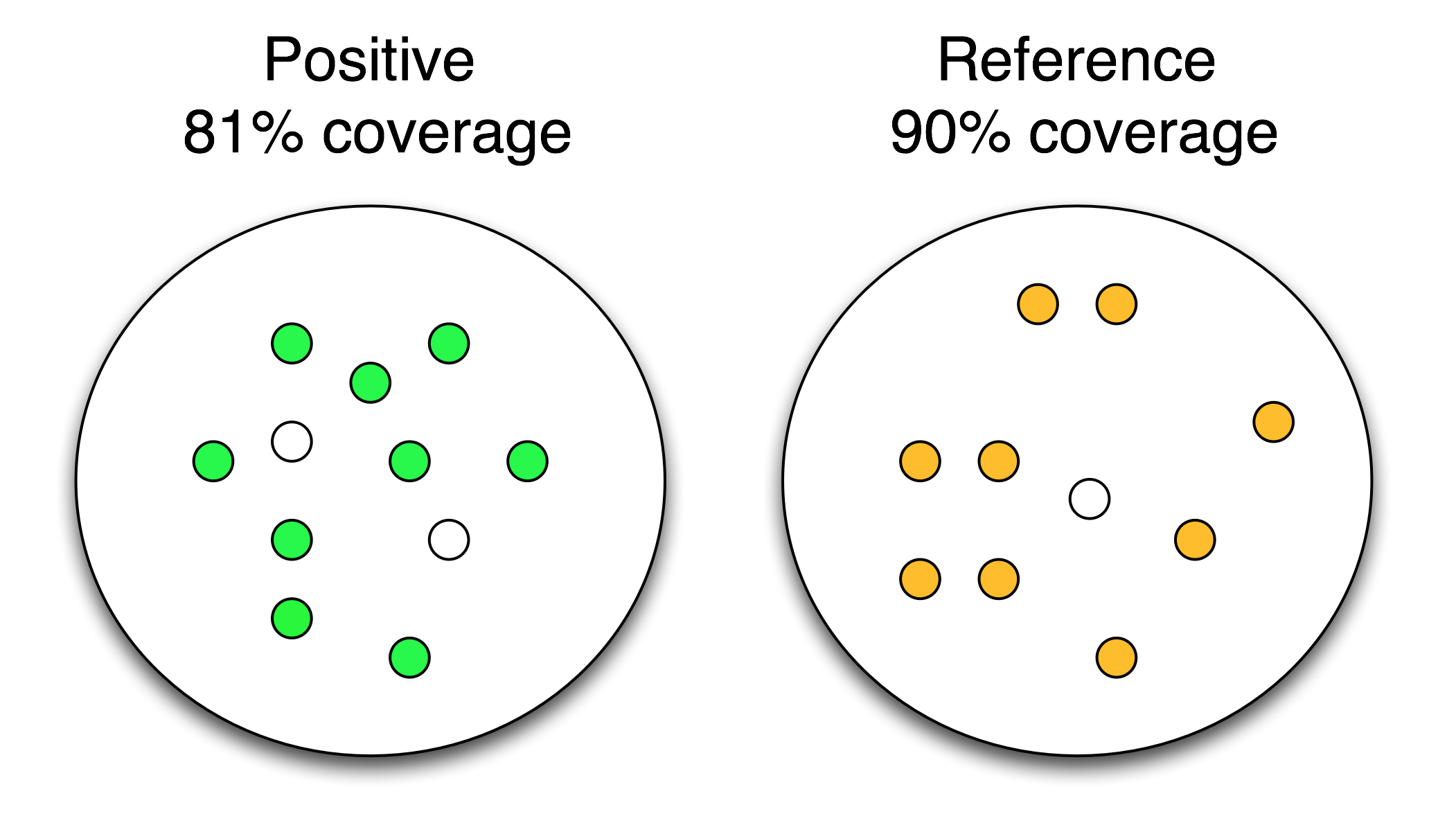
Dataset coverage
Dataset coverage is the strength of an individual physico-chemical property. The “coverage” measures the fraction of the input sets that can be separated by each property and represents the “discriminative power” of the algorithm. The larger the coverage is, the stronger the property is. The image illustrates a single-property result. The colour-filled elements represent entities selected by a scale while the white-filled ones do not exhibit strong-enough property. In this particular example, we can see that the property was strong and had a maximum coverage of 90%. The effect of a property is always oposite between the two datasets, and the number is automatically converted - if a property is positive on one dataset, it is depleted on the other. So technically, in this case all but the white one on the RHS were depleted but because there was strong signal on the Positive, coverage is automatically flipped on the reference.
-
Z-score
Z-score of a physico-chemical scale is an indicator of significance. It measures how difficult is to obtain a certain coverage with a random variable. Random baseline is generated using 15 shuffled datasets of the original datasets. The larger the Z-score is, the more significant the physico-chemical property is (Z-score>6 is considered significant).
-
p-value
The p-value represents the probability of obtaining at least the same amount of signal by random sampling.
-
ROC
The ROC statistic is represented by an area under the ROC curve. This measure is threshold-independent and evaluates how much each of the predictors separate the two datasets.
Grouped properties
Next section utilises information about higher-level grouping of the scales, painting more complete picture about the dataset.
You are presented with an interactive view of the scale groupings. Each of the scale groups is represented by a single plot. The meaning of the individual bars is similar to the previous plot - they show coverages and strengts between the datasets. In this case, if the bar points up, it means that the property is stronger on the positive dataset and vice versa.
Individual scale titles are not shown for all of the items but the plots
are interactive - after clicking on any of the bars, there is additional information
shown on the right-hand side of the screen.
Lastly, the Z-strenght of the properties is also reflected in the plots by
colouring weak properties white (and the other properties in the colour
corresponding to the property).
Scale combinations
The next view includes the combined coverage of multiple scales.
The difference between previous groupings is the coverage
calculation, where all of the scales shown are merged together to form a "super"
scale.
The coverage bars here, however, show slightly different information that the
coverages previously. Now, we can see how the combinations scores on both of the
datasets individually - we no longer have a single property and direction because
we are combining multiple properties with possibly differing directions.
So, what is the actual interpretation of the plot? Let us present
an example. We look at a plot with 5 combined properties that
shows two bars - green and blue. The blue bar points up and the
green bar points down. For a combination of scales ranging from
1 to 5, the blue bars measures which fraction of the positive
dataset can be discriminated from the negative dataset, while
the green bars measures which fraction of the negative dataset
can be discriminated from the positive set. There can be a
difference between those two values and it can be useful to
see which dataset is more covered.
Please note that the algorithm searches the space of all scales
combinations to identify those that have the highest coverage
(see combination statistics in the tutorial).
Combination statistics
In order to see the individual property strengths, one needs to expand the information contained in any of the bars. This could be done either by clicking on any of the bars or on the descriptions of the table below. Once expanded, the information contained shows the scales selected for the combination as well as wide range of group and individual statistics.
Statistics are shown both for the combination's total and for the individual scales. The individual abbreviations are reported in the table on the right.
There is also an additional piece of information shown right in front of the individual properties - it is a sign and is either + or -. It is a simple abbreviation of a direction of a property. If a + is shown, it means that the property is stronger on the positive dataset and vice versa (for example, the + means that same as the bar pointing left for individual properties and a bar pointing up for groupings).
Classifier creation
Provided that there was enough signal and the analysis did run, user has the possibility to create a classifier with their datasets as a model. It is very simple - just quote the submission reference during new clever classifier creation.